Revolt
Building a Bold Identity for the Next Generation of Audio Technology
Project Overview
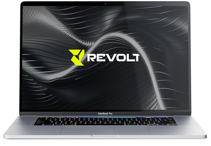
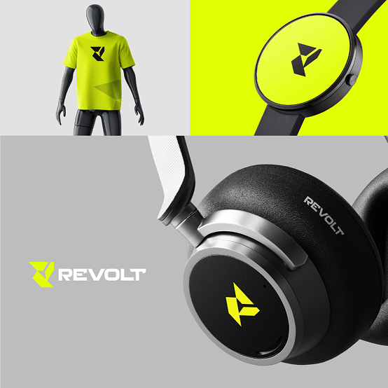
Revolt is a modern consumer electronics brand focused on delivering premium audio products with a bold personality. The goal was to create a visual identity that immediately communicates innovation, power, movement and confidence while standing out in a highly competitive technology market. From the logo to the colour palette and product applications, every element was designed to make Revolt instantly recognisable across digital platforms, retail shelves, packaging and merchandise.
The Challenge & Our Solution
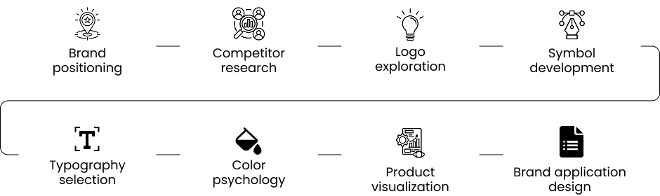
Our Approach
Research & Strategy
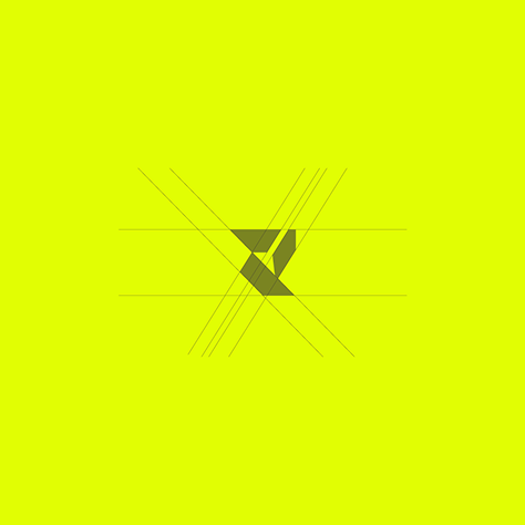
The Revolt logo is built around a custom geometric “R” symbol. Instead of creating a traditional lettermark, we abstracted the character into sharp, angular forms that represent: Movement, Energy, Precision, Innovation, Transformation, The symbol is minimal enough to be recognized even at small sizes while remaining distinctive enough to become the face of the brand.
UX & Product Design
We designed a bold visual identity that reflects innovation, energy and confidence while remaining clean, modern and highly scalable. Key improvements included: Custom geometric “R” logo symbol. Bold neon yellow and black colour palette. Modern geometric typography. Consistent branding across products and merchandise. Scalable identity for digital and physical applications. Flexible brand system for future product expansion. Every element was designed with one objective: build a memorable technology brand with long-term recognition.
Results
A modern geometric typeface complements the angular logo symbol while improving readability across packaging, advertising, and digital experiences.
Key Features
The signature neon yellow immediately captures attention and represents energy, innovation, and confidence. Combined with black, the palette creates a strong visual contrast associated with premium technology brands.
Project Summary
Final Thought
“The goal wasn’t simply to create another tech logo. We wanted a brand that people could instantly recognize on a product, an app icon, or a package. The final identity achieves exactly that with a bold, memorable symbol and a cohesive visual system that can grow with the business.”